- Visualization of networks
- Identify networks and track changes
- Documentation
- Monitor the spectrum instantly, without scrolling through thousands of recordings.
- See immediately what is happening, recognize results that may be wrong (e.g., incorrect detection or decoding), and use these insights to improve monitoring tasks or adjust your decoders.
- Analyze the received data to identify frequencies or decoders that should be blocked because they add no value and only overload your system
shoc-Network-Analysis

Create node network graphics directly from the go2monitor ResultViewer.
Have you ever tried to analyze a table containing 20,000 rows? Finding meaningful patterns can be extremely difficult.
A graphical representation transforms complex data into clear, actionable insights at a glance.
Key Facts
- go2monitor add-on
- A picture is worth a thousand words!
- Connections between elements, making it easy to understand how things relate
- A node graph can represent many-to-many relationships far better than lists or tables
- The most connected or important nodes are detected much faster
- Connections, anomalies, and unexpected links become visible
- Even non‑technical users can understand a visual network more easily than raw table data
Your Solution For
Typical Workflow
Selecting Data Records for Analysis in the ResultViewer
- Select the data records to be analyzed
Use any of the available filter methods, such as Advanced Filters, Structuring, or SQL commands, to narrow down the dataset - Mark the required entries
Select the specific data records you want to analyze—or press Ctrl+A to select all - Export for network analysis
Open the Export function (via the button or right‑click), and choose “shoc-Network-Analysis” from the export options
Select Destination Directory for the Result Files
- Choose the directory for the output files
Select the folder where the generated PNF and CSV files should be saved - Navigate to the desired folder
Browse through the directory tree to find the correct location - Confirm your choice
Press “Select folder” to save the destination
Graphs are Calculated
Based on the configuration file, graphs are automatically generated, stored, and displayed.
Typical graphs are:
- Sender call-sign → Receiver call-sign
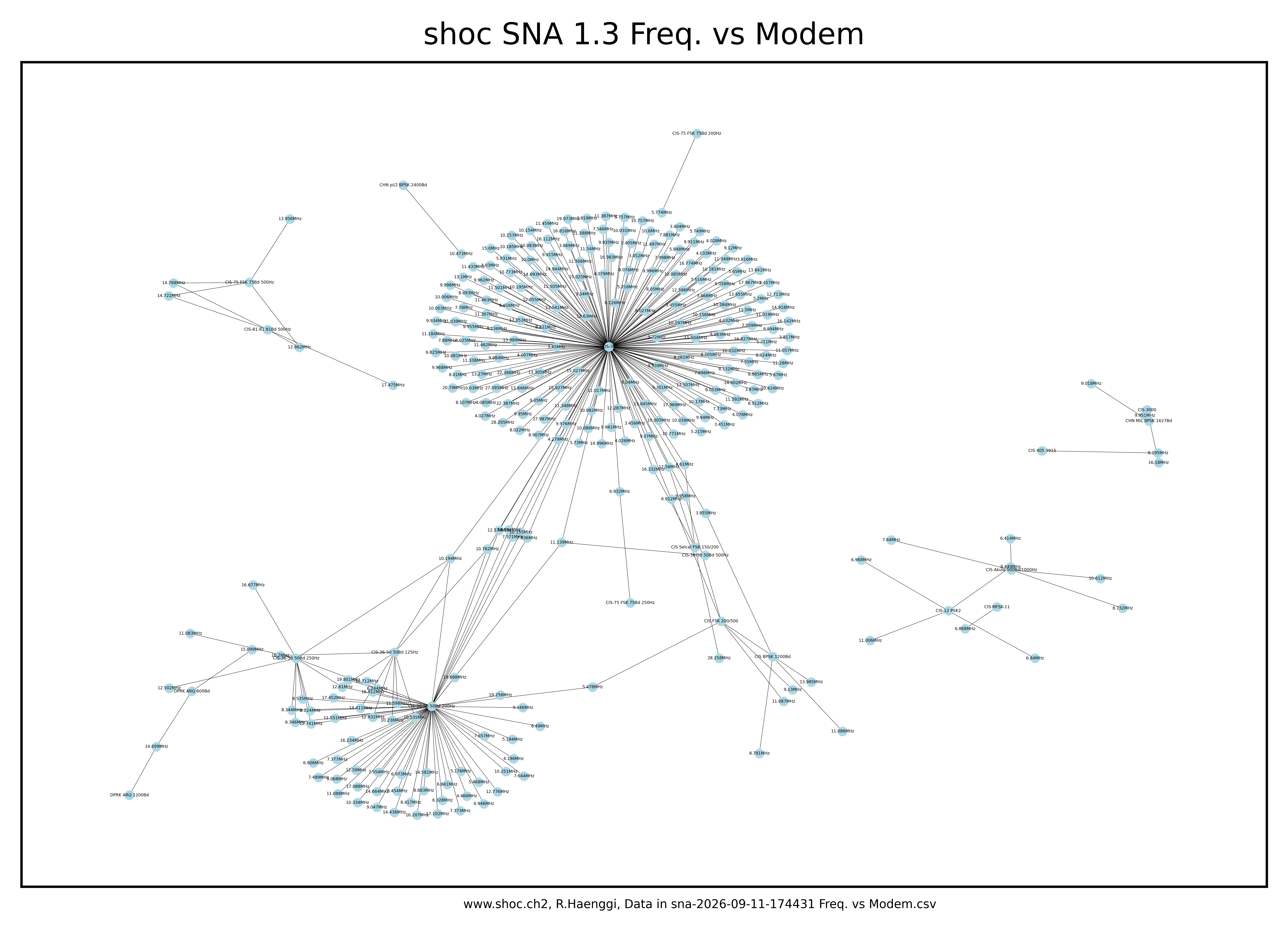
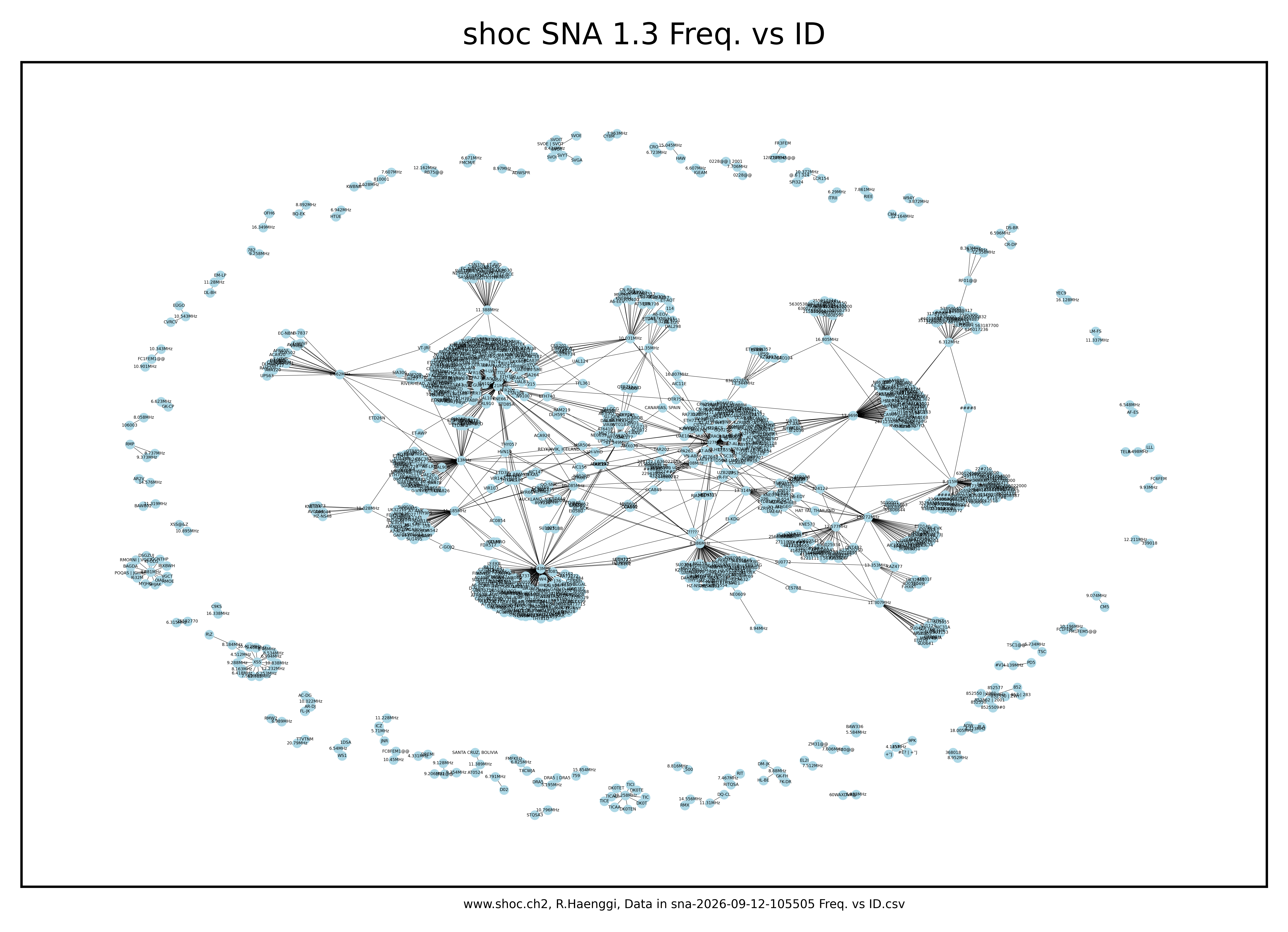
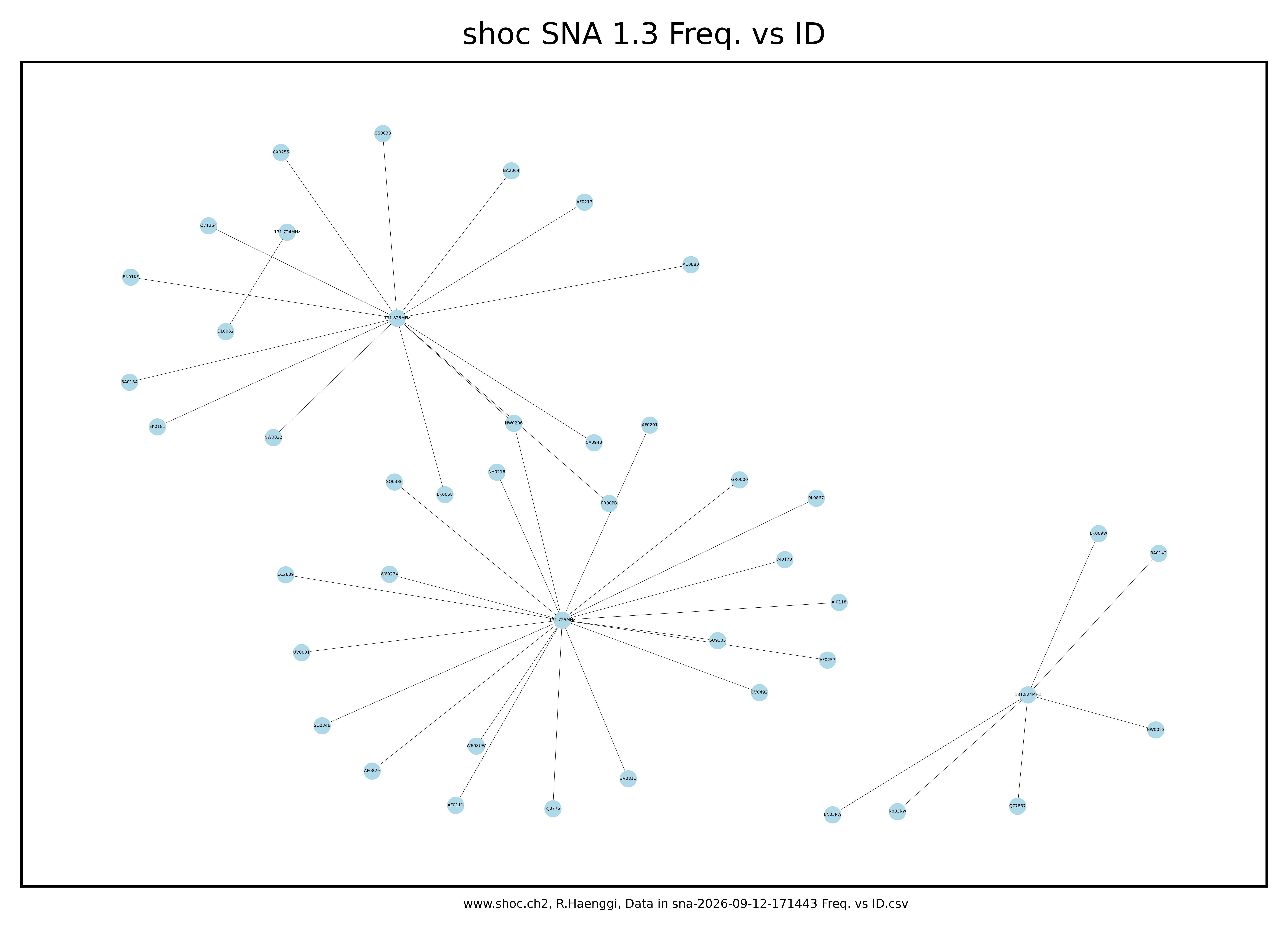
Visualizes which stations are communicating with each other - Call-sign → Frequency
Shows which frequencies are used by which callsigns - Modem → Frequency
Displays which modem types appear on which frequencies - Call-sign → Modem
Reveals which stations use which modem types
Additionally, you can select the desired output format for the generated graphic:
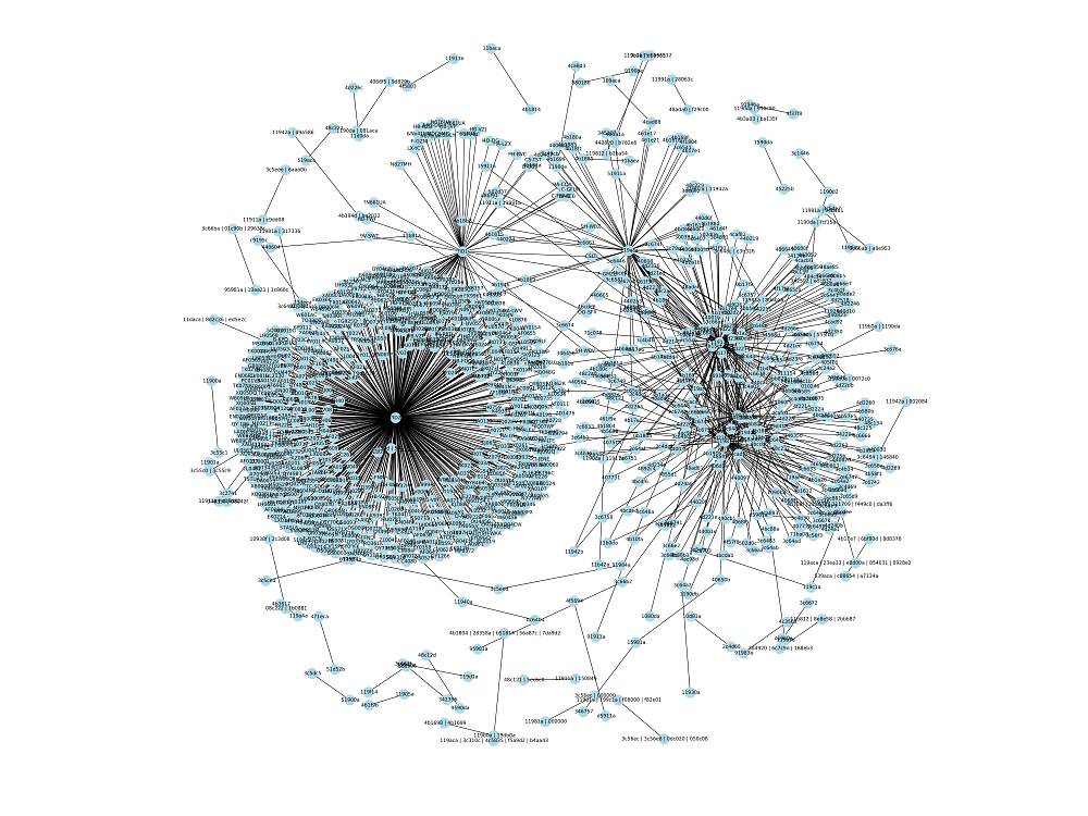
- Fixed PNG file
Creates a high‑resolution static image - Interactive HTML file
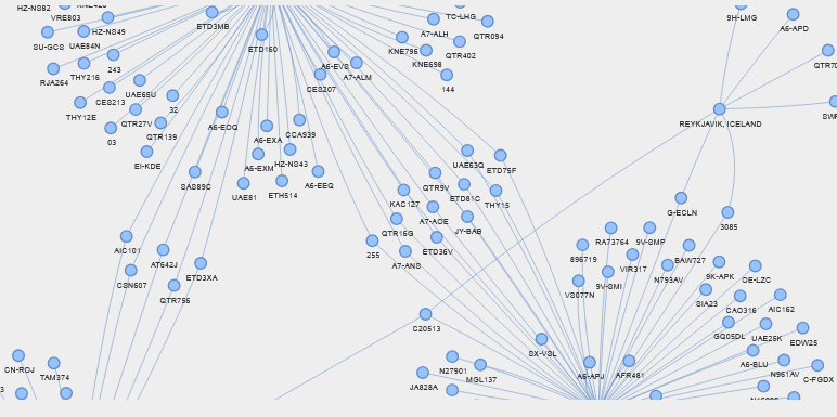
Produces a zoom-able, interactive visualization that allows you to explore the network in detail (rearrangement, highlighting, etc)
Customer Specific Graphs
- The graph can be modified and extended according to your specific requirements. Contact us for a quotation if you require any custom features.
- Adaptable for other systems. The plugin is written in PYTHON and can be customized by us to meet your specific needs.
Sample Screens
For performance reasons, the graphics displayed below are presented in low resolution. High-resolution versions are available for download.
The HTML graphics are provided in ZIP format and may require some time to load and render, depending on your system and browser.
-
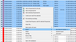
Select the data to be analyzed -

Selecting Output Directory -
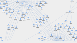
Sender vs Receiver as HTML -
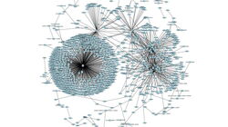
VHF Air Taffic as PNG


shoc-Network-Analysis Downloads
- CIS, CHN 260911 Freq. vs Modem.zip (157.5 KiB)
- CIS CHN 260911 Freq. vs Modem.png (2.5 MiB)
- HF 261112 Freq. vs ID.png (3.8 MiB)
- HF 261112 Freq. vs ID.zip (171.7 KiB)
- HF 261112 Freq. vs Modem.png (3.1 MiB)
- HF 261112 Freq. vs Modem.zip (163.2 KiB)
- HF 261112 Freq. vs Modulation.png (2.9 MiB)
- HF 261112 Freq. vs Modulation.zip (161.9 KiB)
- HF 261112 Sender ID vs Recipient ID.png (3.4 MiB)
- HF 261112 Sender ID vs Recipient ID.zip (171.6 KiB)
- VHF-UHF 260912 Freq. vs Modem.png (1.8 MiB)
- VHF-UHF 260912 Freq. vs Modem.zip (155.8 KiB)
- VHF-UHF 260912 Freq. vs Modulation.png (1.8 MiB)
- VHF-UHF 260912 Freq. vs Modulation.zip (155.6 KiB)
- VHF ACARS 260912 Freq. vs ID.png (958.0 KiB)
- VHF ACARS 260912 Freq. vs ID.zip (153.2 KiB)